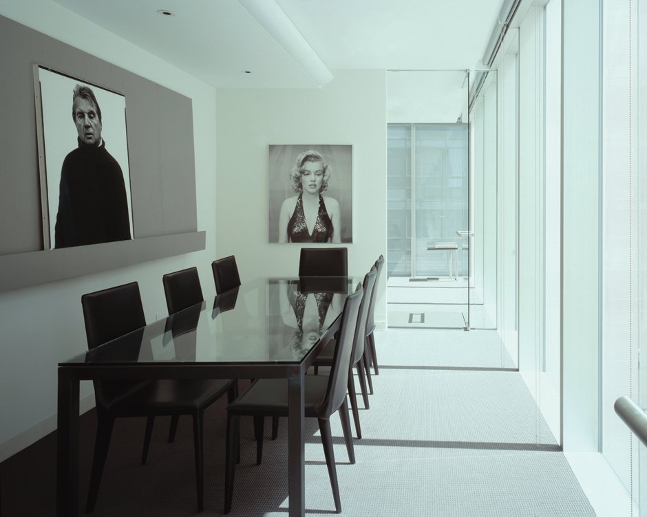
the richard avedon foundation at moma office tower
Completion: 2005 Site: New York, NY Size: 2,100sf
When a representative from The Richard Avedon Studio originally contacted our office in January of 2002, what was initially thought to be a “small project ”- involving only assistance in building a large-scale exhibit model – ultimately turned into the design of two major exhibits in two major art institutions, and then the Foundation, for photographer Richard Avedon.
Over the course of nine months in 2002 we had the honor of working with Avedon and his staff on the design of his “Portraits” Retrospective at the Metropolitan Museum of Art in Manhattan.
Avedon’s portrait work was typically executed in the stark white confines of his studio where he could carefully control the lighting and his subjects.
Working directly with Avedon – in primarily large-scale (1”=1’-0”) models only – we began to understand his innate sense of scale, of foreground and background relationships, and of “choreography”.
Avedon truly believed that the meaning of his images was in large part determined by their context – be it in the form of books or exhibitions. So he listened intently to us and was willing to adopt wholly our plan recommendations about free-standing partition walls in “deep” extended visual space that we then framed through an enfilade of openings.
The collaboration at the Met was such a success that Avedon returned to us the following year to help plan the gallery layout for his “In the American West” show at the Amon Carter Museum in Fort Worth Texas.
At the Amon Carter, as always, the intention was to have Avedon’s larger-than-life prints really jump off the wall. Within the confines of a limited and quirky gallery, we were able to create several of these moments of stimulation along the gallery-viewer’s path.
After Avedon’s passing in October 2004, the not-for-profit Richard Avedon Foundation was established to house and represent his archive.
Our office was commissioned to take inventory of the remaining negatives and prints from Avedon’s photography studio on the Upper East Side in order to relocate them to the newly completed Museum Office Tower at MoMA in Mid-town Manhattan.
The tower architect – Japan’s Yoshi Taniguchi – provided MoMA with strict guidelines of how the spaces were to look from the exterior. An associate architect was also hired by the Museum Office Tower to fit out all of the interior spaces in the building. To date, we have been the only design architects specially brought in to work directly for an individual client in the office tower.
As our design progressed, two issues became abundantly clear to us. First, the needs of The Richard Avedon Foundation did not adhere to a typical office plan; the Foundation had particular requirements more tailored to an artist’s gallery or working print studio.
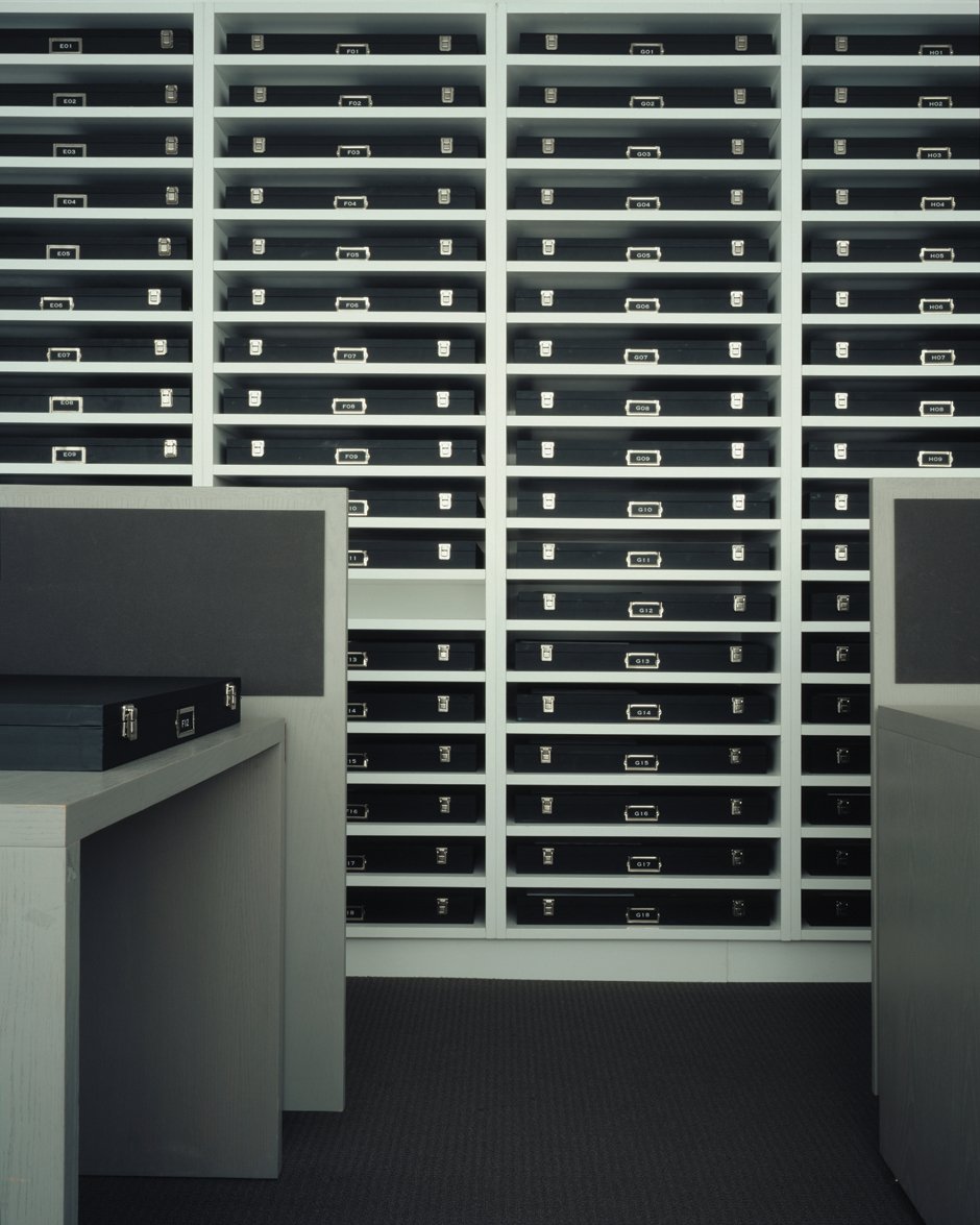
Second, the negative and print storage – because of both it’s volume and the archival importance of the collection itself– should act as the centerpiece of our design.
Our installation sits free from the building’s skin to express the backdrop and celebrate the object or “sitter”; a move similar to the stark white backgrounds of Avedon’s portraits for which he is so famous.
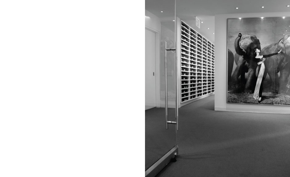
One enters the Foundation through the main “gallery” where the visitor immediately encounters Avedon’s famous fashion shot for Harper’s Bazaar of model Dovima from 1955. Glass doors at the entry were designed with Dovima in mind as the first “visual clue” or signifier of the planning strategy employed throughout our design.
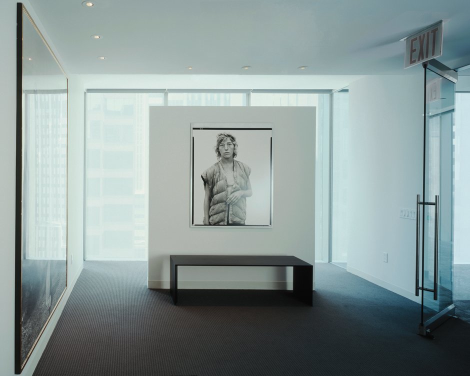
In the gallery we used a floating white partition wall in front of the building curtain wall to create conceptually the sense of “empty” space as a means of making the subject – be it the woman in the photograph or the viewer in our gallery – seem suspended and weightless.
Our intention was to create a space as crisp as an Avedon portrait; with spatial clarity and surface tension both.
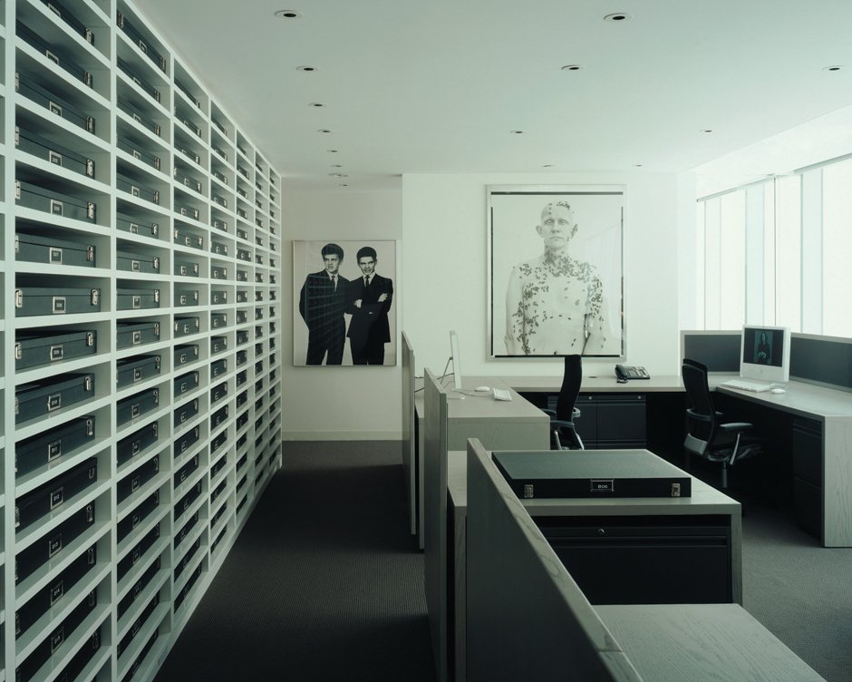
We selected the palette with Avedon’s work in mind. Shades of black, white and gray in custom millwork and furniture describe a small gallery, various work areas, and the centerpiece of the project – the Solander Box Wall – which houses Avedon’s archive in 180 engraver’s print boxes.
Avedon had spent his last years, apparently, reflecting on his considerable archive in an attempt to organize his photographs in a way that would summarize his life.
We felt that the element designed to hold his archive should be equally rigorous – to somehow reflect his intensity and his precision both.
We designed custom millwork for work stations in the main staff area. Charcoal gray “Forbo” tackable surfaces are mounted on floating light gray stained plywood panels.
In the conference room, a custom wall-mounted display piece holds multiple prints and provides flexibility for the foundation staff when meeting with prospective clients.
Similar to the strategies used at both museum exhibits of Avedon’s work that we designed, at the Foundation we again attempted to choreograph movement through, and understanding of, the space – using visual signifiers such as constructed views, precise millwork details and of course the strategic placement of the Avedon prints themselves – to give meaning to the experience.
Photography: Frank Oudeman

